Logo Project


Estimated completion time: 2 hours
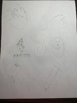
This logo represents the inner me, as I designed my logo to be a needle that is representing a vaccine with fire coming out of it. The vaccine portion of the logo represents how I want to get into a career that deals with medical research in my future. Also, it reminds me of mini-THON, which my high school back home participated in that was an event to raise money for kids with cancer. I was very involved and hold this event close to my heart. The fire coming out of the needle is representing how passionate I am about the things I care about. I strongly believe that a life lived without passion is just boring. I have a fire lit within me, and it also applies to how much I want to go into medical research as well because it is a personal connection for me. Before my grandma had passed away last year, the doctors could never diagnose her and we still don’t technically know what sickness she had. This lit that fire within me to get a career in medical research.
I really enjoyed this project, and my logo was fun to create. I used many different techniques, such as the shape builder tool, to put the vaccination needle together. The most difficult part was getting the fire to look exactly how I wanted it to and also getting the needle to be completely even. I decided on the colors that I chose because I wanted them to be complementary. I also made sure to look at what the three main color-blindness types would see as well. As for my first logo, the red of the fire represents passion and energy, which is exactly what I think of when I think about who I am as a person. I actually found that blue represents feeling safe worldwide, across all countries, so I knew I wanted this color for the vaccine. In my second design, I made the fire blue because even though I am so passionate, I want to use this passion to help people feel safe and make them feel better. I chose orange for the needle stroke because orange represents confidence and bravery, which are two traits I have to possess to go into the field of study that I want to enter. Lastly, for the last design, I made the fire purple because purple represents ambition. I made the needle green because green represents healing and freshness, which is what I want to help people feel through the research I will complete. Overall, I tried to use colors that balance each other out; one color represents something about passion and the other represents something to calm the passion and create peace. This logo genuinely represents the inner me, and reminds me of why I am passionate about being in the medical field.


Comments
Post a Comment