Business cards


For my business cards, I decided to do three different color versions all with my three different color logos with colors that I chose because I think they are aesthetically pleasing. I really enjoyed doing this project because now that I am so familiar with photoshop and illustrator, a lot of the tools are the same or very similar in indesign. I had to use many different tools, such as the frame tool to put my logo in every page, many different layers so I could keep track of all my backgrounds, text, and images, and also the rectangle tool to create my backgrounds. I also played with the opacity for mainly the backs of my business cards by turning down the opacity, so it looks like the back of a business card.
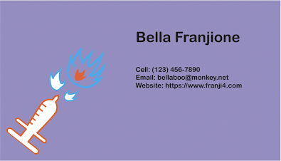
For my first business card, I really wanted to use the idea that the words were kind of shooting out of the needle with the fire. That is what I was going for and I think the color lilac works very well with the orange and blue of the logo. My text is black because I tried other colors, but it just wasn't working for me and I did not like how it looked, so I figured you cannot go wrong with black text. My second one is by far my personal favorite because I really like putting pink and purple together. Also, for the back side of this one, I like the geometry I messed with because I put two purple squares in diagonal corners. I wanted my third business card to be a bit different, so I went with the gradient background because I like the light to dark and wanted to put my logo on the left with white text on the right. I really like the way my business cards came out, and this project was very enjoyable for me.


Your Business cards came out very nicely. I like how they are very vibrant and eye catching. Did a really nice job on changing u the color scheme on all three. Overall project came out very nice.
ReplyDeleteThank you so much, Bryan! I definitely love vibrant colors, and did try to pick three completely different color schemes that went with each individual logo.
DeleteYou did an excellent job at creating such unique business cards! They caught my attention, I definitely would be interested in your company after seeing them. The simplicity of the business cards is what makes them so great, I love all the aspects of your business cards. Also I really like how you included which one was the front and back of each card.
ReplyDeleteThank you, Catie! I really am a simple person, so I knew I wanted to make my business cards really capture that.
DeleteI really like your business cards. My favorite one by far is the second one. I think what makes them so cool is really how unique your logo is and it really just grabs your attention when first glancing at them. Great Job!
ReplyDeleteThank you, Morgan! The second one is my favorite by far, as well. Pink and purple are my favorite colors. I am happy my logo caught your eye because that is definitely what I wanted.
Delete