Posts

Final Portfolio

Image
         For my final portfolio, I wanted to go with a playful look. Every other page is either light pink or light blue, as these are my favorite colors. I like that these colors give off a cotton candy vibe because cotton candy reminds me of being a kid again. If I could, I definitely would be a kid again. I chose to keep my portfolio very simple because that represents me the best. I like to do what I'm good at and do it well. I did not want to go too crazy because then I feel like it can be hard to look at. I think the pink and blue colors work really well with a lot of my projects as well. For example, my butterfly calligram is pink and blue. I really spent a lot of time making sure this looked perfect. This project took me about 6 hours to complete. I rewrote all of my artist statements because I did not want to have too many words on one page.          For this project I used many different techniques, such as text wrapping, using the frame tool, and also working with the di

Business cards

Image
Business card 1 (front to back): Business card 2 (front to back): Business card 3 (front to back):          Estimated time to complete: 2 hours          For my business cards, I decided to do three different color versions all with my three different color logos with colors that I chose because I think they are aesthetically pleasing. I really enjoyed doing this project because now that I am so familiar with photoshop and illustrator, a lot of the tools are the same or very similar in indesign. I had to use many different tools, such as the frame tool to put my logo in every page, many different layers so I could keep track of all my backgrounds, text, and images, and also the rectangle tool to create my backgrounds. I also played with the opacity for mainly the backs of my business cards by turning down the opacity, so it looks like the back of a business card.           For my first business card, I really wanted to use the idea that the words were kind of shooting out of the needle

Indesign 3 Tutorials

Image
 The pencil tool  https://www.youtube.com/watch?v=rnXFsq8FEec           I think that this tool will be pretty easy to use, in general. It's giving me very much adobe illustrator pen tool vibes. All you have to do is draw your line and then let go and then you have the line that you wanted. I think I will use this tool a lot if I wanted to draw something specific, and something that can have some rougher edges. I found it super interesting that you can move the line across the x and y axis, and you can rotate whatever line that you draw. I also thought it was interesting that you can put a shadow behind your line, and basically do anything that you desire with it. I feel like this tool is going to prove to be very useful to me whenever we start this new program.  The line tool https://www.youtube.com/watch?v=jEvvDVKH8Go          I think that this tool looks super easy to use, and I feel like this would be a very good one to use. I like that this tool, unlike the pencil tool, will gi

Autoscopy Project

Image
  Estimated time to complete: 1 hour               My initial inspiration for this project was that I feel like sometimes I have my head in the clouds. I feel like I am a daydreamer, and I always find myself staring into "space." When I do catch myself staring into space, I like to think about aliens. I have always though aliens were so cool and we barely know what life exists on our planet, so I definitely do feel like there has to be some form of life on other planets. I also wanted to play with the idea that I like to stare into "space," by using some elements from space, such as the UFO and aliens. I thought this would be clever.                I had to use many different tools to get this project completed how I wanted it to be, such as the quick selection tool to make all of my masks. I had to make four different masks for myself, both aliens, and the UFO. I also added adjustment layers to everything to make the colors exactly how I wanted them. I also had to

Somewhere Project

Image
  Time to complete: 1 hour               For my somewhere project I decided to use a photo from Family Feud because this was one of my favorite shows to watch when I was growing up. I figured that I could pretty easily photoshop myself as one of the family members standing at their podium, so this is what I decided to do. I also always wanted to be a contestant on this show, so I knew that this project was my chance to get as close to being on the show as I could. I used many different techniques for this project, mainly the masking technique. I had to mask myself out of the photo that I placed embedded into the original photo of the family. I used the refine edge brush tool, to get a more perfect image of myself around the rough edges that were originally present.                Once I had the proper image of myself in there, I placed in a few different adjustment layers to try and make myself blend in a little bit better. I messed with the hue and saturation and vibrance adjustment l

photoshop photos inspo for somewhere project

Image
           I think it would be hard to photoshop myself into this because of the shape of the instagram post that is already photoshopped in there and also the specific lighting and clothing that would have to be perfect.           This inspired me for the somewhere project because I feel like it could be cool to photoshop myself being next to or with an olympic medalist, or I could put myself on the podium or something like that.           This one really made me laugh because I thought it was funny that instead of making the kid taller, he made the dad shorter by removing his body.           I thought this illusion was funny and also looks really doable if I would want to try it. I really liked this illusion.

Photoshop project BW to color

Image
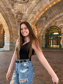
  Time to complete: 6 hours          I chose this picture to being with because I feel like it is a great representation of myself. I am always happy and love my city of Pittsburgh, which is in the background of the photo, so that is why I knew this photo was absolutely perfect. I had to use many different techniques in this project that really stressed me out, and took me a very long time to get exactly as I wanted. Utilizing many different layers in photoshop was definitely my key to success, as I don't know if I would have been able to do it without all these different layers. Many tears were shed in doing this project, as getting the tag brush into photoshop was difficult, too. In the end, I prevailed.           My color choices were based off of the fact that in the original picture I really liked the way that my blue jeans popped. I chose a blue that I liked on color.adobe and I ran with it. My absolute favorite was definitely square, as that is the first one that I completed